Search This Blog

Welcome to Rendering Tutorial Site

Welcome to Rendering Tutorial site. This site is develop to help artist, architects, advertisers, visual artists and hobbyist a place to share, gain and learn from tutorial writers, important knowledge, tricks and tips in using rendering and image processing software. Some of the link here were cross posted from other sites, some of them were develop for this site, and some of them were shared wholeheartedly by different individuals.

Wednesday, 31 August 2011

Vray 2.0 MAterials

James Cutler written this tutorial for Mintviz


Diffuse

Diffuse
This is the actual colour of the surface, reflection and refraction colours can affect the visual appearance of this colour. It is important to understand that no material in the real world is pure white RGB (25,255,255) nor pure black RGB (0,0,0). When creating a white or black material, set the colour values to an off white RGB (245,245,245) / black RGB (2,2,2). If you render an object that is pure white or pure black you will notice that there is no contrast. The light rays are bouncing all over the place, and not being absorbed.

Roughness
Can be used to simulate dust on a surface by controlling the way the surface reflects direct light.

Reflection

Reflect
Like diffuse it uses a colour value to determine the reflection strength. White RGB (255,255,255) is fully reflective and black RGB (0,0,0) is not reflective at all. By using colour instead of grey scale you will get coloured reflections. You would commonly use a grey scale value to determine the reflection strength and there is no right or wrong value so you will have to take your best judgement. However the following can be used as a guide.
By default the reflection colour acts as a filter for the diffuse colour and the stronger the reflection colour the dimmer the diffuse colour.
Metals
  • Pure aluminium polished, 80 – 87 %
  • Pure aluminium matte, 80 – 87 %
  • Polished aluminium, 65 – 75 %
  • Matte aluminium, 55 – 75 %
  • Aluminium painting, 55 – 65 %
  • Chrome polished, 60 – 70 %
  • Steel, 25 – 30 %
  • High polished copper, 60 – 70 %
  • High polished brass, 70 – 75 %
Composites
  • Light oak (Polished), 25 – 35 %
  • Dark oak (Polished), 10 – 15 %
  • Wood chipboard, 25 – 40 %
  • White paper, 70 – 80 %
Ceramics
  • Granite, 20 – 25 %
  • Lime stone, 35 – 55 %
  • Polished marble (Depending on colour), 30 – 70 %
  • Light stucco, 40 – 45 %
  • Dark stucco (Rough), 15 – 25 %
  • Concrete (Rough), 20 – 30 %
  • Bricks new, 10 – 15 %
  • White tiles, 75 – 80 %
  • Glass, 5 – 10 %
Finishes
  • White enamel, 65 – 75 %
  • White lacquer, 80 – 85 %
  • Silver mirror, 80 – 88 %
  • High polished mirror, 92 – 95 %
Diffuse colour also affects the reflection intensity. White reflects the entire visible colour spectrum whereas black absorbs all colour.
  • White, 75 – 85 %
  • Light grey, 40 – 60 %
  • Middle grey, 25 – 35 %
  • Dark grey, 10 – 15 %
  • Light blue, 40 – 50 %
  • Dark blue, 15 – 20 %
  • Light green, 45 – 55 %
  • Dark green, 15 – 20 %
  • Light yellow, 60 – 70 %
  • Brown, 20 – 30 %
  • Light red, 45 – 55 %
  • Dark red, 15 – 20 %
  • Black, 2 – 5 %
Fresnel reflections
Most materials except metals have a Fresnel reflection, making the reflection strong at glancing angles but weak at more front on angles. A good example of this would be to look at an old CRT monitor, where the viewing panel is glass. If you position yourself to the side of the monitor and look into the glass you will clearly see a reflection of the environment, but if you position yourself directly in front you will notice that the reflection is reduced. Fresnel is a good approximation and is as close to physically correct materials as you can get whilst keeping the rendering times low.
The Fresnel Effect was first documented by the French physicist Augustin-Jean Fresnel (1788-1827). Fresnel studied the behaviour of light and how it was transmitted and spread by different objects.


Fresnel IOR

IOR stands for index of refraction and is used to measure how light refracts through a surface relative to the viewing angle (Yourself), confusing at first but read on. Place a stick in a pool of water, notice how the stick bends below the water surface? As light passes through the water surface it changes speed and bends.

IOR can also be used to measure reflection and how light reflects off a surface relative to the viewing angle (Yourself) and although calculated in a slightly different way they are usually directly proportional. Therefore the same IOR value is a good approximation for both reflection and refraction. This is why by default it is locked to the refraction IOR. A formula known as Snell’s law is used to describe the relationship between the angles of incidence (Viewing angle) and refraction which gives you the IOR.

You can find many IOR tables on the internet and they all give different values for real world materials. The truth is there is no actual value, it depends purely on the material and its characteristics such as dirt, scratches rust and so on. But if you need a value then below is a good starting point for the most common materials.
  • Water 1.333
  • Glass 1.5 – 1.6
  • Diamonds 2.13
  • Compound materials such as wood, stone, concrete etc. 3 – 4
  • Plastics 5 – 8
If an IOR of 1 is used, then light reflects/passes off/through the surface without changing direction, meaning it has the same density as air. Materials such as glass allow light to pass through, but also reflect. The ratio between reflection and refraction is dependent on the viewing angle. Geometry must have a thickness to refract properly. If you have window glass that has no thickness use an IOR of 1.0.

You can control the Fresnel reflection using a falloff map. However this method is known for rendering slower than the built in Fresnel control.


A falloff map will create a transition between the front and side colours (By default front is black, sides are white). It will use the falloff type to determine the type of reflection. With Fresnel selected, the black colour will be positioned front on angles and it will transition to white as it becomes more of a glancing angle. You can change that falloff by adjusting the IOR value, or by adjusting the output curve, or both.

Highlight glossiness
In the real world highlights are reflections of light sources and the surrounding objects. In computer graphics there are two different methods to calculate the same effect. The first is to make no distinction between lights and objects. The second is to treat lights separate from objects. One may be desired over the other for a particular scene.
By default highlight glossiness is locked to the reflective glossiness because in the real world they are the same thing. Highlight glossiness is better known as specular. It takes the reflection of a direct light and adds it to the surface of the material, since direct light is usually round the specular highlight is therefore round.
The 3ds Max Scanline renderer calculates reflection this way, and although unrealistic it is still favoured by some for artistic reasons. In reality reflections come from the area of the light source such as a bulb, therefore it would not be round and it would have certain characteristics. If the highlight glossiness is unlocked you can control its shape separate from the reflection glossiness. This has become part of the method for achieving car paint materials.

Reflection glossiness
A value of 1.0 means the reflection is mirror, lower values mean the reflection is more blurred. The more blurred the reflection the longer it takes to calculate.

Subdivs
This controls the quality of the reflection glossiness. The higher the reflective glossiness, the lower subdivisions you can have. If the subdivisions are too low the result will be very noisy.

Use interpolation
You can cache glossy reflections to speed up rendering. Since light cache for glossy rays has been introduced, this method is somewhat redundant as the results were never that good.

Dim distance
You can set the maximum distance a reflection ray will travel. As an example, if set to 100mm, anything outside the 100mm radius will not be reflected.

Dim fall off
A fall off radius for the dim distance.

Max depth
Controls the amount of times a light ray can reflect. A max depth of 1 means only 1 reflection on the surface and a max depth of 2 means that a reflection of a reflection can occur on the surface. Higher values increase render times.

Exit colour
When the max depth has been reached it will use the exit colour. You may reduce the max depth to keep render times low and instead rely on the exit colour. In most cases you would set the exit colour the same as the diffuse colour such as for a green glass bottle.

Refraction

Refract
A colour value is used to determine the refraction strength. White RGB (255,255,255) is fully refractive and black RGB (0,0,0) is not refractive at all. By using colour instead of grey scale you will get coloured refractions. You would commonly use a grey scale value to determine the refraction strength and there is no right or wrong value so you will have to take your best judgement. However the following can be used as a guide.
By default the reflection colour acts as a filter for the diffuse colour and the stronger the reflection colour the dimmer the diffuse colour. For tinted glass it is best to control the tint colour via the refraction colour. By setting the diffuse colour to black (0,0,0), it has no effect on refraction colour. You are effectively turning the diffuse colour off.

IOR
An Index of refraction (IOR) value describes the way light bends as it travels through a surface. A value of 1.0 means the light will not change direction.

Glossiness
A value of 1.0 means sharp, clear refraction, lower values mean the refraction is more blurred and frosted. The more blurred the reflection the longer it takes to calculate.

Subdivs
This controls the quality of the refraction glossiness. The higher the refractive glossiness, the lower subdivisions you can have. If the subdivisions are too low the result will be very noisy.

Use interpolation
You can cache glossy refractions to speed up rendering. Since light cache for glossy rays has been introduced, this method is somewhat redundant as the results were never that good.

Max depth
Controls the amount of times a light ray can pass through a surface before it stops. A max depth of 1 means that only 1 refraction through a surface and a max depth of 2 means that a refraction of a reflection can occur on the surface. Higher values increase render times. As an example if you were to look through a drinking glass it would have 4 surfaces. A max depth of 4 would be correct. However you may need to take into account loss of light energy therefore higher values are needed.

Exit colour
When the max depth has been reached it will use the exit colour. You may reduce the max depth to keep render times low and instead rely on the exit colour. In most cases you would set the exit colour the same as the diffuse colour such as for a green glass bottle.

Fog colour
Controls the attenuation of light as it passes through the surface, darker colours absorb more light whereas lighter colours don’t absorb the light as much. Naturally thicker objects will become less transparent than thinner objects. By setting the fog colour to green it can be used to simulate coloured glass.

Fog multiplier
The strength of the fog colour is controlled by the multiplier. Higher values will make the object less transparent and lower values will make the object more transparent.

Fog bias
If used it will control the way in which the fog colour is applied. You can make thinner parts of the object more or less transparent than the default.

Affect shadows
If ticked, the object will cast transparent shadows, depending on the refraction and the fog colour.

Affect Channels
Here you can specify which channel is affected by the transparency of the material. For glass you would need to choose all channels so that both reflection and refraction are effected.

Dispersion
In the real world as a ray of light travels through a refractive object it produces a caustic effect which consists of a ray of colours. This is now an option in Vray 2.0, previous versions of Vray only allowed you to render white.

Abbe
At the default value the amount of dispersion is physically accurate in accordance with the IOR. You can increase or decrease for artists reasons. Increasing the value means the dispersion will be less visible and narrower whereas decreasing the value will spread out the dispersion and make it more intense.

Translucency

Type
You cannot see through a translucent material, but light can partially travel through and be scattered around. Materials such as human skin and wax are some of the most common.

Back-side colour
By default the colour of the translucency effect is dependent on the Fog colour. However you can additionally tint the effect using this parameter.

Thickness
You can limit the number of rays that are to be traced below the surface of the material by adjusting the thickness. This would therefore limit the amount of visible light.

Light multiplier
Control the intensity of the visible light.

Scatter coefficient
The amount of scattering that will occur inside the object. 0.0 means rays will be scattered in all directions where as a value of 1.0 means a ray will not change its direction.

Forward/backward coefficient
Controls the scatter direction of a ray, 0.0 means a ray moves away from the surface. 0.5 means that a ray has an equal chance of moving forward or backwards. 1.0 means a ray will move towards the surface.

BRDF

The BRDF types determine the type of the highlights and glossy reflections for a material. You would use Ward for metals such as stainless steel. Blinn and Phong for plastics and none metals and Blinn for chrome materials. Calculation speeds do vary for each type. Phong is fastest, followed by Blinn, and then Ward.
Soften
You can control the blending between the light and dark areas within the specular reflection.

Fix dark glossy edges
Unwanted dark edges may appear, use this to eliminate them.

Anisotropy
Changing this value makes the reflection directionally dependent for materials that have a fine grain such as brushed metals and woods. Reflections would appear more blurred if you were looking against the grain. Reflections appear less blurred if you were looking with the grain. A value of 0.0 means the reflection is isotropic, meaning the reflection is the same in all directions.

Rotation
Control the orientation of the anisotropic effect in degrees. You can also use a texture map to control the direction.

UV vectors derivation
Control how the direction is chosen by either using local axis or map channel.

Options

Trace reflections
Turning this off means that reflections will not be traced, but highlights will still be shown.

Trace refractions
Turning this off means that refractions will not be traced.

Cutoff
Control the threshold for which reflections/refractions will not be traced. Reflections that hardly contribute to the final image sample will not be traced. Using a higher cut-off means faster render times. If set to 0 the render times will be very slow, there needs to be a threshold in order for Vray to know when to stop calculating.

Environment priority
Determines what environment map will be used when you override the environment of various materials and they reflect/refract each other.

Double-sided
When ticked the back facing surface will be flipped. The Scanline renderer ignores back facing surfaces to speed up the rendering process. By default Vray will not ignore polygons, one of the reasons is because a back facing surface may still be visible within a reflection/refraction.

Reflect on back side
For materials such as glass you would need to turn this on to get a realistic result so that reflections are calculated on all surfaces. This will however increase render times.

Use irradiance map
By default the irradiance map is used to calculate diffuse indirect illumination of the material. Objects with fine details may render with artefacts, but you can render these objects better by turning off use irradiance map in the material. Then Brute forced will be used for that material only.

Fog system units scaling
Enabled by default, the fog colour attenuation becomes dependent on the system units. If your scene has not been modelled to real world scale you may get unwanted results with this on.

Treat glossy rays as GI rays
If set to always you are telling the material to always use the secondary GI engine to calculate the glossy rays, which in this case is the light cache. It basically does the same job as use light cache for glossy rays but you can specify individually which materials within the scene use this option.

Energy preservation mode
You can choose a different way of distributing light between the reflection and the diffuse layer. As in the real world the reflection level dims the diffuse and refraction levels causing the visible reflection to not be 100% of the reflection RGB value. To make the reflection 100% of the reflection RGB value, set it to monochrome, that way the diffuse colour has no effect on the resulting reflection colour.

Maps

Here you can add texture maps to control the effects of each property of the material.

Reflect/Refract interpolation

Here you control interpolation of glossy reflections. The options are somewhat similar to the options for the irradiance map in the render setup.

VRAY Ambient Occlusion

Tiago Alexandrino shared this in Vimeo. Ambient Occlusion in Vray.


Ambient Occlusion with V-ray from Tiago Alexandrino on Vimeo.

Tuesday, 30 August 2011

SKETCHUP VRAY RESOURCES

Sketchup and Vray Resource site created by Nomeradona is full of gems. I have joined ASGVIS, Sketchucation, and now Chaos Group forums; I have not seen as plenty as resources as this site. This site is a must to visit if you are a SketchUp and V-RAY SketchUp user.

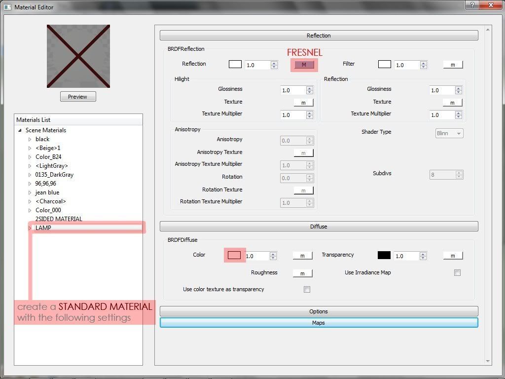
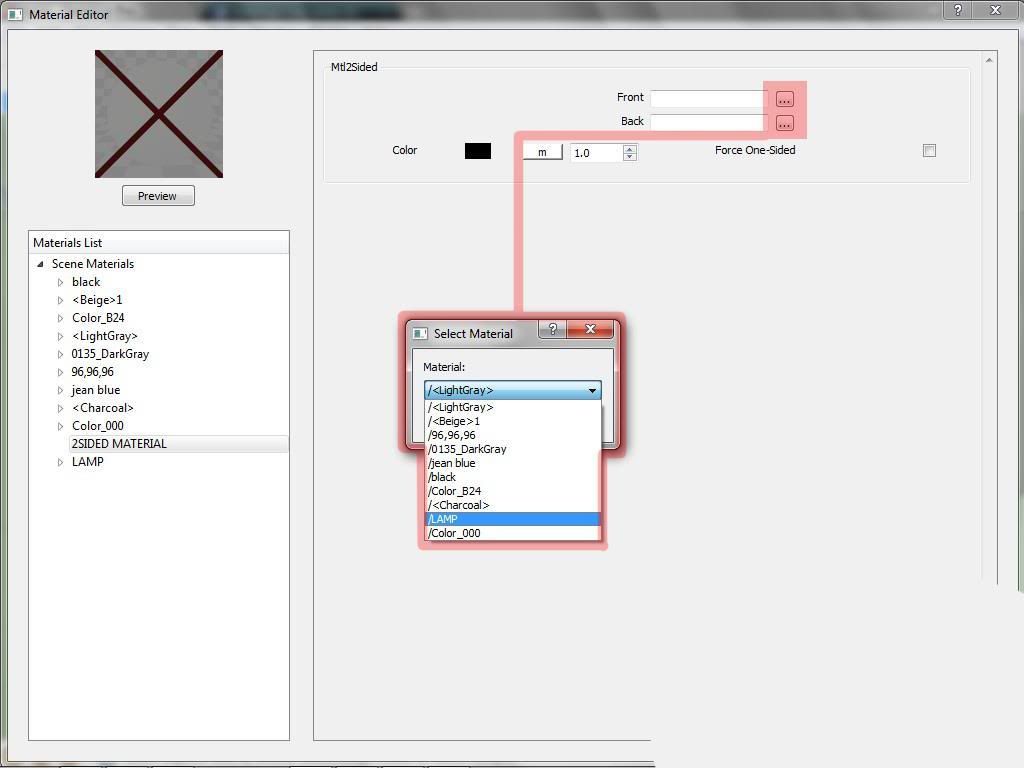
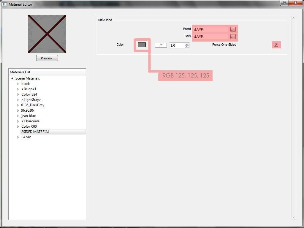
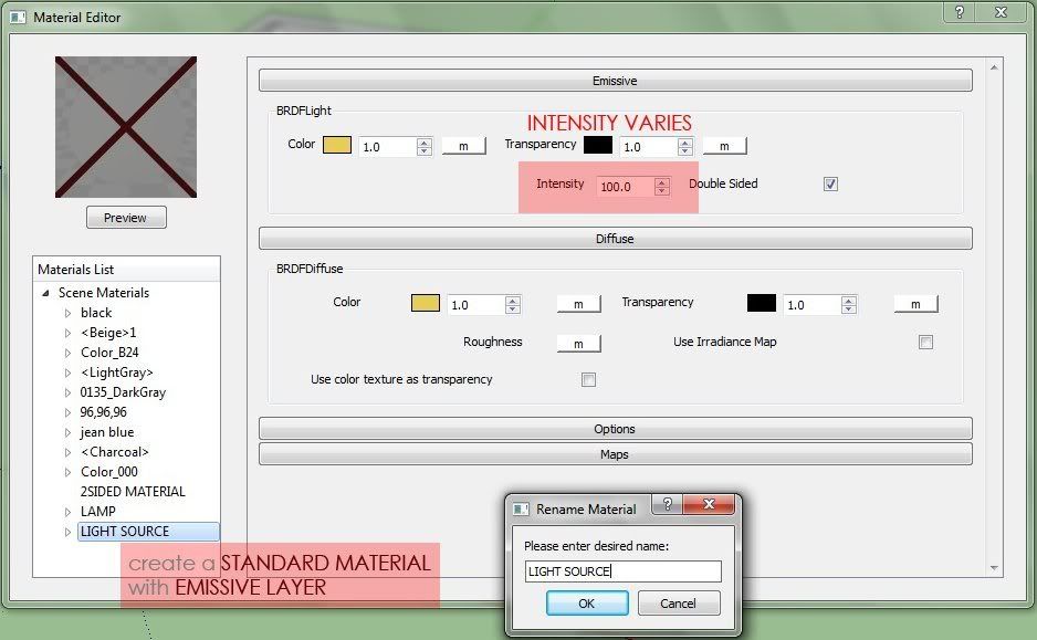
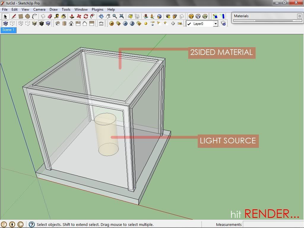
Here is a sample tutorial from this site. How to simulate lampshade materials in Vray SketchUp
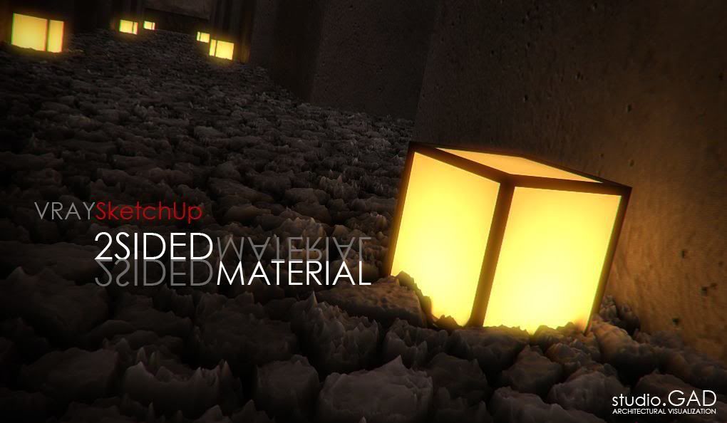
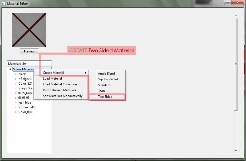
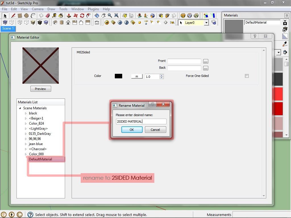
Vray double sided material allows seeing the light on the backside of the objects. Vray artists use this material to simulate thin translucent surfaces like paper, lampshades, curtains, leaves and others. Gerbe Dumahil explained in this nifty tutorial how to simulate lampshade material using double sided material in Vray SketchUp.


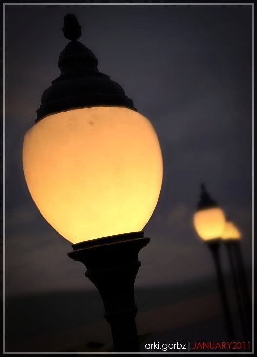
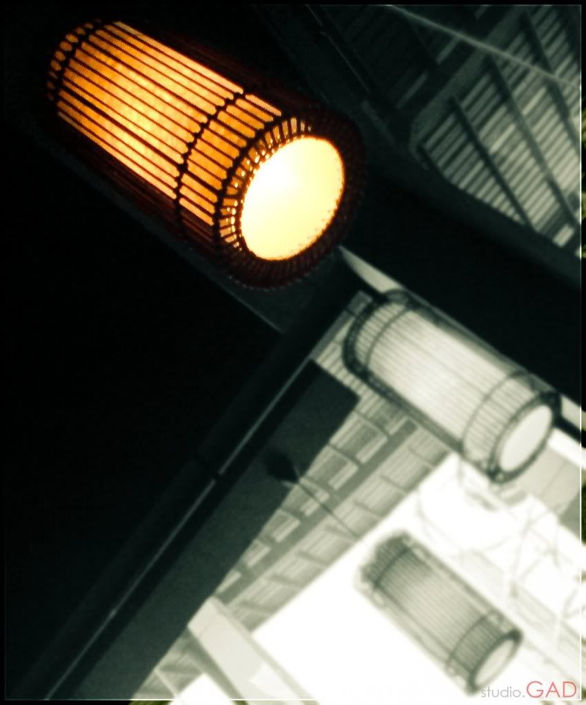
More on Gerbe Dumahil's render using this material.


Brix

BRIX

When texturing large expanses of wall or floor with a tile, brick or parquet image, vizualisation artists face a familiar dilemma: how to avoid visible tiling without losing too much resolution? In other words, large maps that show no tiling are either incredibly big RAM-wise, or they are not detailed enough to be seen up close. Maps that cover a smaller area may have the necessary amount of detail but show visible tiling when seen from a distance.

Materialwerk, has just released BRIX, a new tool for 3dsMax that could just be the solution, at least when working with tiled materials (planks, bricks, tiles, mosaics, stone cladding, etc.)

To me, BRIX was one of these rare no-brainer purchases. However, as this is quite a new tool, I thought I would post a small explanation of how I used it to create the following image. Click on this post for the full details.


First two remarks: This is the result of blind experimenting. I may have overlooked or misunderstood some of the settings, so feel free to correct me. Secondly, BRIX comes with 1.4Gb of ready-made high-quality materials, which should fulfill most needs without the need to dig into material creation. For me, however, it was imperative to use BRIX to create new materials with my own maps (I mostly use my own photos but in this case, I used a map from CGTextures to get started).
BRIX is essentially a 3dsMax texture plugin. After installation and registration, two new maps are available, the BRIX texture and the BRIX Slave texture. The BRIX texture includes the Brick Designer Tool, which allows you to load individual tile images (which you would have prepared in advance in a 2D editor) into separate diffuse, alpha, bump, reflection and displacement slots (you don’t have to fill all the slots if you don’t need them). The following captures show the settings for my red brick texture and the Brick Designer UI. For this material, I used 30 different images of bricks, though very good results can be obtained with far fewer images. Be warned that preparing the individual maps, especially if you want to use all the slots, can be time consuming. The best workflow, it seems to me, is to first create the bump, displacement, specular, etc. versions of the big map you are using as a starting point, arrange them into one document with layers, and only then to start cutting the map into individual brick images.

A very nice feature of the BRIX map is that it allows you to create random variation for nearly all slots. You can randomly tweak the hue of the diffuse map (allowing you for instance to create a varied brick wall with just one map), vary the position of the bricks, and even the tilt and displacement values of individual bricks.
BRIX offers various bond patterns (a few more would be nice) and the option to randomise them using a jitter function. The “Common” section allows you to change the aspect ratio of the tiles (you will want very elongated tiles, for instance, when working on a parquet floor), and how many rows you want to have (few rows for large slabs, lots of rows for tiny mosaic tiles).
Once your BRIX map is ready, you can use it pretty much like any other map in Max. One novelty is that the map is coded in such a way that Max will understand which information to use depending on which slot you’re plugging it into. If you use it in the bump channel, for instance, Max will automatically draw the info it needs from the bump channel of the the BRIX map. For the reflection and glossy reflection channel, however, you should input it first into a BRIX Slave texture, whose role it is to extract these channels from the master map. The Slave map does not seem to correctly pass on bump or displacement information, but since you can use the master map in these channels, it does not really matter. Here is a shot of the Slave map and the settings for my Brick material (in Vray).
One nice thing is that the composite BRIX map offers you feedback in both the Max viewport and UV editor, which allows you to refine the placement of the bricks, though I found that the viewport occasionally differs from the final render, which can be annoying (though it may be my own mistake). Here is how it looks in the viewport:
Now that’s pretty much all there is to it. The end result is a map that can cover huge areas without visibly tiling and can still be seen in all its detailed glory up close (and that without overburdening your RAM). Of course, the final result will depend on the quality of your maps. Materials with either no or a rather homogeneous mortar work best. There is also an option I haven’t tested to create a procedural mortar. The few gripes I have concern the Brick Designer, which could be faster. There should be an option for instance, to load all images in one slot at once (If there is one, I haven’t found it), or to copy one image from one slot to another (from bump to displacement for instance) rather than reloading it several times. The good news is that you only have to create a BRIX map once as the settings can be saved in an .xml file for fast re-use.
All in all, I would warmly recommend BRIX to any perfectionist architectural vizualiser. Here are a few more examples done with other CGTextures images. The green mosaic material only uses 13 different tiles.
Originally posted at http://bertrand-benoit.com

Monday, 29 August 2011

Tutorial: Daylight with Vray and 3Dmax

Here is another excellent tutorial from Aleso.


Welcome to another exciting tutorial.  In this tutorial I will show you how to use the Daylight System in 3DS Max and VRAY. This is a nice tool if you are looking for a specific place of the earth for lighting your scene. I want to show some different ways of creating realistic renderings with V-RAY and 3DSMax.

The lighting in this scene is a little bit more complex in relation to other tutorials here in the site, so you can learn how to setup different type of lights to have a nice bounce of lighting.

Lighting sources in the scene:

1.-Daylight System
2.-Photometric Lights with Ies Profiles
3.-Vray Plane Light
4.-Vray Light Material

I have include the scene files for download
download vray scene

To create a daylight system go to Geometry>Systems>Daylight, drag your compass and your are done. This is the position and settings for the daylight system:

daylight system tutorial
daylight system 3ds max settings

For each window I used a Vray Light Plane with Kelvin Temperature and this is the settings of the lights:

vray light kelvin temperature

For the lamps and the other Photometric Lights this is the settings that i used:

photometric wikipedia

The light to the counter tops coming from the cabinet i used a vray light material with a orange color and 100 of intensity

Vray physical camera settings

vray physical camera

Now the render settings, nothing too fancy, the same as the last lighting tutorial, here is the setup:
vray render setup

If want to learn more about materials setup, modeling, and post-production techniques of this image, you can download the scene files, also the package contains some video tutorials about modeling, materials, lighting, render setup and post production with Adobe Photoshop.

I have included some render presets and photoshop actions for changing the look of any render just with a click.

download vray scene

Some other renders from this scene:


Sunday, 28 August 2011

Tutorial: How to model a pillow in Rhino

Flying Architecture is fast becoming an excellent resource center. Click the images to view the tutorial.

part1 part2
(Thanks to Toby Humphrey for making some corrections in my grammar and making this tutorial readable)
It’s me again, Matus. Several people have asked me how to model a pillow in Rhinoceros, which I have been using in some of my scenes. Instead of just sharing this model I am going to show you how to do it! Here is the final product:


This tutorial is going to be very quick, the whole modelling process took me approximately 10 minutes. This model was done in Rhinoceros 5 WIP, so you can see me using Gumball tool, which is not included in Rhinoceros 4. (but you can download it for Rhinoceros 4 as a plugin from official McNeel website, or use the one from T-Splines toolbar, if you have it.)
Okay, let’s begin: First of all, we need to make a square, 400×400mm and explode it:


Press Ctrl+A to select all of these 4 lines, type the Rebuild command and press Enter. Set the ‘Point count’ from 2 to 10 and the ‘degree’ from 1 to 3 (the degree number 3 will make curves from our simple lines). You can always click the image below to see a full resolution screenshot.


Select all the curves and press the F10 button to show the control points. Select the ‘top view’ and drag the corner points a little bit inside the square, creating filleted corners.


Now drag all the other control points in and out of the square, so they will be placed randomly. This forms basic frame for upholstery surfaces.


Duplicate these curves and move them up vertically by 75 mm.


Hide the original curves, so you can see only the duplicated ones. Again show the control points (from the menu, toolbar, or by pressing F10.


Now the INSERT KNOT command: It is not necessary to rebuild the entire curve with 20 or 50 control points to make it super-detailed. All you need is to insert some knots close to the places where you need your curves to be more detailed.


And this is it. Make some deviations on these curves. Remember we are still in the 2D ‘top view’!


Now for some more fun. Switch to the ‘perspective view’ and make some new deviations in the UP/DOWN direction where required.


Do the same with original curves, which have been hidden until now.


The corner control points on the lower curves must move up and the corner control points on the upper curves must move down!


Create a line (length 150mm) and move it vertically up by 50 mm.


Rebuild the curve, just as in the picture (click on the small picture to see a full resolution version).


Drag the control points up and down to make them look more random.


Make 4 new lines connecting the corners of curved squares with endpoints of the new curve:


Explode these lines (just in case you drew polylines) and rebuild them:


Select these lines again, show the control points and adjust their position, again in the up/down direction.


This is now how it should appear in Rhino:


Okay, now for some more new curves…Use the ‘polyline’ tool to connect the middle points of the last four curves.


The explode & rebuild:


Show the control points again and adjust their position:


Now for the surfaces:
Okay, now that we are done with the boring stuff let’s work on the actual 3D surfaces. Keep in mind one important rule: DO NOT JOIN SURFACES! Okay, select the curves as you see in the picture and then select the ‘curve network’ option from the ‘surfaces’ menu.


Click ‘okay’ in pop up window and you have your first surface complete. Nice, isn’t it?


Repeat the same for the rest of these curves, resulting in the upper part of the pillow:


Select all the surfaces in the model and uncheck the box called ‘show surface isocurves’ leaving you with clean organic surfaces with no additional isocurves.


Select the border curves for lower part of the pillow and create a surface as we did previously.


Create layers and organise the scene items into them.


So this is where we are now:


Hide all the surfaces, so that only the curves are visible. Make some additional curves, as shown in the picture:


Once again rebuild them:


Adjust their position (using the control points).


Create some interesting geometry:


And that’s it for the curve adjustments.


Create a new surface in the same way as before, by selecting the ‘curve network’ option from the ‘surfaces’ menu.


Do the same with the other curves.


So now we’ve got it! The surfaces are finished. Categorise them into layers.


Show all the surfaces and hide all the curves. Now we have an almost completed pillow.


Great, now for the final part: The piping.
Select the border curves, join them and use command ‘pipe’ to create a pipe running along their length using a radius of 1.5mm.


On the other curves, use ‘no cap’ option, so you have only surfaces (not polysurfaces). Use radius of 1.2mm.


Finally, we have completed all the modelling!


Postproduction.


This is the pillow I have from the last step. I have switched from Rhinoceros 5 (now in WIP version) to Rhinoceros 4, where I have my V-ray engine installed. There was no problem in saving it in R4 format and I haven’t seen any mesh or geometry problems, so switching between these two Rhinoceros versions (R4 and R5) appears flawless.


In this picture you can see my settings for fabric material – it has got Diffuse and Bump maps, and of course – reflection layer with very low values. Set Reflection Glossiness to 0.4 and Highlight Glossiness to 0.2. Top up subdivs from 8 to 22. Rendertime is going to be longer by topping up last value, but you will get much better effect than with value of 8. Bump Map multiplier is set to 3, to get “higher” and more realistic effect.


Now pick your favorite fabric texture and apply it to your model. I chose this one not because it is my favorite, but because this will show me very well how the model is texture mapped. It looks creepy, probably, but do not hesitate!


Click Texture Mapping option in Rhino, select Custom Mapping and check values under UVW repeat. All of them are set to 1. Check also UVW rotation, where all values are set to 0 by default.


Adjust W rotation for every single surface until you are satisfied with the result. Usually values like 90 and -90 degrees are the best values for this. I am satisfied with values of 1 in UVW Repeat, so I am not going to change them in this step.


In here I’ve made special material for “pipes” – for parts where I used Pipe command. Check it out here: It has only a diffuse color and strong bump map (multiplier 4).


And that’s all for mapping textures. After next few steps I will get back to mapping options, but now I am going to set up the scene. The scene is very very simple. Have a look:


Let’s make some ground. Add V-ray Infinite Plane and make the square floor, like you can see in the image.


Here I have changed the materials of the pillows to make them look less uniform. Change the textures and check the surfaces and their mapping – in this step I have changed Repeat values to fix textures deforming on their surfaces. These values really depend on what size and ratio of your texture is, so please try to tweak it on your own.


In the scene is only one light – V-ray sun. Set the multiplier to 0.5 and adjust its position in the scene.


In this screenshot  you can see my complete V-ray Render Options: As you can see, my Irradiance Map is very low, Min and Max rate: both at -3 (only 1 prepass!) and only 20 samples. This will make my render very quick. I always use Physical camera, no matter what. In Environment section set your Sun light (usually Light 01) into GI and Background. Switch from Adaptive Subdivision to Adaptive DMC and turn your Antialiasing ON. Don’t forget to check Sub-pixel box under Color Mapping.


Render the scene. Rendering took maybe only 1 and a half minute at 800×954 pixels thanks to low Irradiance map. Safe the frame as HDR for better postproduction!


Open up Photoshop. Click IMAGE>MODE>16bit. Now turn your Gamma Value to 2.2 and move Exposure slider as you want. Now you are in 16 bit mode and you can use all the Photoshop adjusting effects. (You can use only some of them in 32-bit mode). As you can see, I’ve used Vibrance, Curves, Levels and Color balance effects. How the scene looks like depends on your monitor settings, so use the sliders until your image is really nice :)
I’ve also created some Vignetting effect. If you are using this step as I do, use dark blue color (sth like #041b36) for vignette layer.

You can also see Z-depth layer in my picture. This layer I have drawn myself. You can choose to generate it straight in V-ray channels option, but I decided to make my own. By generating a V-ray Z-depth channel you get physically correct blur in Photoshop, but what I wanted to do was to have an absolutely sharp first pillow, a slightly blurred second pillow and a heavily blurred last pillow, so I drew it using black, grey and white. Then I’ve used a very strong Gaussian blur value for this layer. After this, duplicate the layer with the pillows, go to CHANNELS, create new layer and paste previously drawn B&W layer. Now go to FILTER>BLUR>LENS BLUR. Now you can easily adjust Lens length and amount of blur using the B&W layer you have drawn! When you are satisfied, click OK an save your image :)


Now if you want to save your image, you can’t save it as JPG file. It’s because you are still in 16-bit mode. Go to IMAGE>MODE>8bit. Now you can save your image as JPG file.
And here is the final render with Adjustments in Photoshop. What do you think? Do you like it?
If you like my effort and this tutorial, or models helped you at least a little bit, please consider donation via PayPal :) If you want to support me, just click the PayPal banner in the right sidebar. Thanks a lot!


And this is the end. Here are some navigation options: